The challenges:
- The
owner wanted to save money in the redesign of the rooms by having us
use items from her own house to stage this property. Minimal
improvements only to the walls or structure.
- Finding
the color scheme in the existing pieces of
furniture and accessories to create a cohesive theme.
Judge the results for yourself
from the before and after shots of the staged property. But I think the result
is a house that looks warm and inviting!
BEFORE - Living Room
Red brick fireplace and yellow tinted walls and light brown rug. hmmmm, what to do...
Red brick fireplace and yellow tinted walls and light brown rug. hmmmm, what to do...
I saw this old painting in the owner's garage and I found the inspiration for the English style for the living room by pulling together all the colors: red/maroon, blue, beige, brown, and gold. The color scheme on this painting also set the tone for decorating the different rooms.
AFTER - Living Room
To complete this corner's look, I used the my friend's beautiful silk floral
arrangement and serving platter.
BEFORE - Living Room Window
Window is exposed to the street and curtains are very short.
The owner wanted it covered so it can't be seen from the outside but didn't want to spend a considerable amount on the curtains.
AFTER - Living Room Window
To bring out the gray colors on the floral chairs, I
used grey curtains that my son used to have in his room.
To create a different look, I hand-tied the
white sheer curtain and accessorized the rod with silk flowers to highlight the rosy flowers on the chairs.
I added
cups (with blue teapots design) to bring out the color of blue from the cobalt urn by the
fireplace
I pulled
out the blue color from the painting by using the cobalt vase I found in
the owner's basement to contrast with the redness of the fireplace
and to hide the dark, old
fireplace.
BEFORE - Hallway
AFTER - Hallway
By adding
a runner in the hallway it gives
this space a brighter look.
BEFORE - Kitchen nook
AFTER - Kitchen nook
In this room, I wanted to create a liveliness
and brightness to contrast with the brown cabinets by combining the
red and blue, giving it a classy contemporary
look.
BEFORE - garden urn
Before - contemporary dining set
AFTER - Kitchen Table

I
combined a garden urn and glass table to create a more up to date look with my pillows and table accessories.

I brought in a few different plates and candlestick accessories to complete this tablescape.

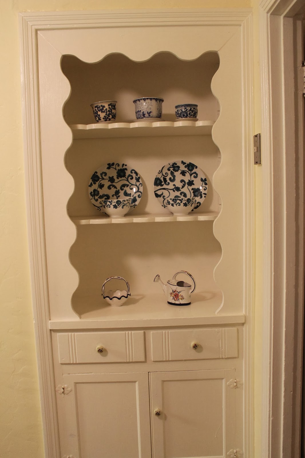
To give this space personality, I found all kinds of blue
and white accessories in the
owner's garden and kitchen and displayed them on this
corner opposite the kitchen nook.
BEFORE - Kitchen counter
AFTER - kitchen counter
BEFORE - Family Room
AFTER - Family Room
Kept the brownish gold curtain and added a golden-hued
sheer. Used the rattan furniture that the owner stored in the
garage and borrowed my friend's rug to bring out the red, gold and brown
to look more inviting.
BEFORE - Master Bedroom
AFTER - Master Bedroom
Gold and
brown is more pronounced in this room. Found a bas relief golden column
from the bedroom of the owner and switched an old lamp shade to simply
add flare to the base of the golden white lamp. We had to borrow my
friend's bedding to complete the color scheme for this room. The wall is
adorned by cement flowers that came from the garden.
BEFORE - 2nd Bedroom
AFTER -2nd bedroom
The idea for this staging is to make the buyer see the decorative possibilities of the rooms and readily imagine themselves living there. The power of
accessories!
See Also:


WOW!
ReplyDeleteThank you! It's always fun to work with accessories.
Delete